

As a sister-series to my "Pushing Around Green Stuff" articles, I'm starting my painting tutorials this year. I'll be diving into how-to articles for some of the painting effects and techniques that I've either learned how to do from others, discovered for myself through trial and error, or a combination of the two.
To kick off this series, we're going to go through something I've struggled with in the past, power and force weapon effects.
Oh come on now, like you didn't see this coming? I'm painting Grey Knights, fer Pete's sake!
I'll detail out the paints used, as well as any other key supplies I needed first, then move into the techniques. Keep in mind, while this will specifically move us through with the colors I used, the techniques are still sound and can be applied to other color combinations.
Supplies and Paints
Thamar Black
Skorne Red
Khador Red Base
Khador Red Highlight
Menoth White Highlight
Raphael Series 8404 Size 0 Brush
Wet Palette
Steps 1 - 3

Step 1
Base the blade half Skorne Red and half Black.
Step 2
Blend the Skorne Red and Black fairly evenly into each other.
Step 3
Thin out your Skorne Red on your wet palette for a good flow, and paint out the first of the electrical lines in a random pattern from the red tip into the black. This will give you a nice, gradually appearing electrical bolt down the length.
Steps 4 - 6
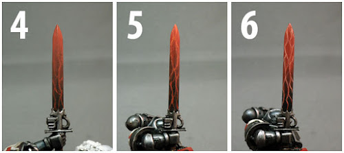
Step 4
Thin out the Khador Red Base and brighter the tip of the blade while tracing a very thin over layer on top of the first stage of electrical bolts. You should still see some of the first bolts!
Step 5
Mix the Khador Red Base with the Khador Red Highlight in a 1:1 ratio, which you then thin out. Selectively trace your electrical pattern to begin to bring out some bright points in the lines. Key words here are "Selectively" and "Some". If you go too far, you'll obscure the earlier details you worked to layer in.
Step 6
Take the 1:1 ratio from Step 5 and brighten a bit with the Menoth White Highlight to create a 3:1 or 4:1 ratio of your earlier mix to white highlight, and thin out. Very selectively bring out the junctions where the bolts cross and intersect, and other key areas in the lines. This is the final highlight.

This is the first time I've ever done a more interesting effect on a power or force weapon beyond a clean blend from one color to another, and I'm pleased with the results. I just hope I've helped make this seem more attainable to someone than I originally thought it was before I gave it a shot myself.
I plan on doing one for the Grey Knights main armor as well, but I'll throw it out to you as well...what would you like to see a tutorial on when it comes to painting techniques?
- Tim
Looking good, keep it up.
ReplyDeleteThis is a great tutorial. thanks.
ReplyDeleteThis is great!
ReplyDeleteI've never blocked the colour out and then blended from there - I tend to blend up or down from one or the other.
Have you considered applying the principles of "non metallic metals" to this technique in order to help give the shading a greater degree of contrast...
What I am suggesting rather than painting the top red and bottom black in your step 1... paint half the sword the other way around... and alternate them again on the rear. Then continue your blending.
I think this would work with the way you do things because the lightning itself is a constant colour so is effectively layed over your "underblend"... if that makes sense??
oink
Awesome! Bookmarked! Thanks.
ReplyDeleteThis is a great tutorial!
ReplyDeleteSorry it's taken me a bit to reply folks, having some family stuff come up.
ReplyDeleteGlad y'all like the tutorial :) Especially considering this is the first time I've done one like this.
Oink, I've thought about diving into a technique like that, but unfortunately my time constraints have me in a bit of a bind. Although, using that addition to this process for apainting competition figure is not out of the question!!!
I did something like this last week to get ready for the Bay Area Open but it didn't come out a third that good. Excellent work! The half and half in step one makes a big difference.
ReplyDeleteThe fact that you've done it before though is a step that few take. I'm going to have to check out what you took to the Bay Area Open. Man I need to find an excuse to get to that tournament one of these years...
DeleteThe half and half step is mainly just for my piece of mind in assembly-line batch painting to make sure everything remains consistent :) If I were doing this for a one-off character fig, I'd probably begin blending IMMEDIATELY after laying down those two colors, so there wouldn't be much drying before blending :)
I'm still pretty new to this 40k thing. My lines didn't come out so fine, either. I did get a fair lightning effect, though. I'm not great at blending... though I'm getting to be pretty good with an airbrush!
Deletesuper useful tute thanks :)
ReplyDelete